Author Archives: Ian Shaw

About Ian Shaw

Photographer, OCA BA(Hons) L3 student

Research Point – Barthes


  • Written in 1964, a seminal essay on the analysis of a photographic image from the book Image-Music-Text
  • Barthes starts out by highlighting the Latin root of the word image as presenting a key conundrum.  Image is derived from imitari– copy or representation.  I.e. Not the same thing but a facsimile
  • Bathes asserts that there are three types of encoded message, the literal, coded iconic and non-coded iconic
  • Literal – the accompanying words and text.  In his example, the brand name of the food suggests Italianicity.  The Literal can be either Anchorage or Relay:
    • Anchorage – the viewer is directed to a clear meaning.  Used as captions in newspapers, titles for images and so on, which will generally have text informing us of exactly what it is that we are looking at
    • Relay – less prescriptive, the viewer has space to explore the relationship between the image and text in their own way; used in cartoon speech bubbles for example where the viewer will interpret the story from the dialogue and image sequence.
  • Coded Iconic – he points out the split shopping bag, suggesting produce fresh from the market and so plentiful that it is bulging out of the shopping bag
  • Non-Coded Iconic – the literal visual. E.g. ‘A tomato’ or ‘a pepper’.  Supports the other coded Iconic and literal elements.

Barthes’ analysis asserts that the drawing is connoted far more than the photograph because everything in a drawing is a connoted decision on the part of the artist, even the choice of brush marks.  By contrast, the photograph always has a coded Iconic element to it as the ‘there then’ presented as a faithful ‘here now’ copy (despite choices made by the photographer to connote meaning through framing, colour/black&white, exposure and post-processing).

How can I develop the ideas of Anchorage and Relay in my own work?

  • Irony: a caption that at first sight appears contrary to the image.  This may be used as a device to initiate a Relay instead of Anchorage (which would be an anachronism).  For example, a photograph of a dropped ice cream with the caption ‘Enjoying the holiday’.  Perhaps a child dropped it and cried – hardly a happy event.  Maybe other images in the set would suggest it might have been thrown with carefree abandon when something even more attractive presented itself
  • Hidden story: Relay titles that prompt the viewer to find a deeper meaning in the visual image.  For example a beautiful female portrait with a title that suggests the series of images show secretly unhappy women forced to work in the sex trade.  Healthy looking crops and issues around GM and pesticide use, as another example. Similar to the previous but with a social or documentary angle, maybe inviting us to question our own purchasing decisions
  • Where a series interweaves two storylines, Anchorage titles would make it clear which fits where, avoiding confusions.  Like cinematic lighting and mood being used to differentiate separate sub plots in a film.


Summary – Part 4

Having turned the corner in my earlier fears, Part 4 saw me starting to enjoy the course more.

This was helped by an interest in how advertising and politics manipulate and manage the messages we receive, so I found the exercises to be particularly interesting.  An online subscription to Source magazine provided a steady stream of Advertising articles by Judith Williamson which I found fascinating.

The impact of titles was something I discussed with my tutor as an area I’d not previously looked at in detail.  I noted my tendency to give images tight titles which forces the viewer down my intended meaning – I learned to be less directive and allow space for the viewer to explore their own meaning more.

This has made me much more aware of the coded messages that I consciously or unconsciously include within my own work, which I feel comes through as a more self assured result in Assignment 4.  While this is a personal reflection of life inspired by a poem from Edward Thomas, it opens up the viewer to make their own conclusions about their relationship with the past, present and future.

Summary – Part 3

Part Three took me into myself more, exploring the idea of self portraiture and expression of self – or providing a window into the lives of others.

Although not directly related to photography, I learned a lot about this from studying Tracy Emin’s famous installation ‘My Bed‘. It taught me a lot about how I needed to date to expose my own thoughts, feelings and motivations to be able to deliver engaging and authentic work.

My now Barthes was a constant companion and will freely admit to having to re-read the    ideas around Anchorage and Relay a few times before I gully grasped where he was coming from with Coded Iconics and Non-coded Iconics.  Whereas Sontag is easy to read with a characteristic tempo, examples, illustrations, lists (and use of the Oxford comma!) to paraphrase her style, Barthes was far harder going.

Nevertheless, I was by now starting to feel braver in expressing myself. In one of the exercises I explore a darker side of self in Exercise 3.2, something I would have felt vulnerable exposing before.

All of the above prepared me to take the rather scary prospect on of photographing a memorial that was all over the mainstream media at the time for Assignment 3.  There was a little cry of ‘I did this’ inside me when I heard back from my tutor that inspired me hugely in the remaining parts of the course.

Part 3 was that turning point for me, underpinned by a growing understanding of what portraiture is and how others feel about doing it from the coursework.

Summary – Part 2

Part 2 took me deeper into portraiture and I found it to be quite challenging at times to simply do the Exercises.  Constrained by working full time and a fear of approaching strangers (made easier after Assignment 1) my progress slowed.

There was even a low spot where I questioned by ability to succeed with this type of portraiture.

Travellers.jpg

With hindsight I can see however that this was a pivotal point in my development.  Until this point I’d been clinging on to the comfort blanket of being able to photograph people ‘professionally’ as a wedding photographer.  My ego was saying ‘I can do this, people pay me money!’ So it felt less of a personal failing not to be able to do this type of contemporary art portraiture.  Once I broke this down and accepted that I had to ‘learn a new way’, I started to build confidence and make progress.

Later in the course I learn new ways to do this – particularly around being clear on having my artistic aims in mind when first approaching people.

Summary – I&P Part 1

Part 1 offered an inspiring and engaging start to I&P, if the thought of Assignment 1 at the end of it left me slightly cold.

It especially moved me in my outlook towards typologies, shifting my perception from them strange collections by eccentrics such as the Bechers and Huebler to appreciating the power of combining related things to make a new point entirely.

It was also the first time I’d explored the work of Cindy Sherman in detail.  This coincided with a visit to the Tate Liverpool where I was able to view some of her work in a gallery.

Historical portraiture also brought new insights that I’d never considered previously.  While writers such as Wells and Warner provided insights into the early motives towards portraiture, it was fascinating to contrast this with more contemporary approaches – especially Max Koslov’ ‘Theatre of the Face’ and Angier’s ‘Train your Gaze’, both of which have been constant sources of inspiration throughout I&P.

References:

Angier, R. (2015) Train your gaze: A practical and theoretical introduction to portrait photography. 2nd edn. Fairchild Books & Visuals.

Kozloff, M. (2007) The theatre of the face: Portrait photography since 1900. Phaidon Press.

Warner Marien, M. (2014) Photography: A cultural history. 4th edn. Laurence King Publishing.

Assignment 4 -Assessment and changes in response to tutor feedback

Along with my tutor I decided to remove the image of the fishing shelter and replace it with another one on the contact sheet, just a view of the same water.  This held the same connotations and meaning but opened the image up more to the viewer’s own interpretations.

_IMG0455

Removed image

_IMG0454

Added Image

Additionally, I removed the image of the gentleman looking up at the wall.  Although a strong image in its own right this introduced more text to the overall work (along with the introductory summary and poem), potentially causing confusion in a viewer.

_IMG0380

To further strengthen the narrative and relationship between the text and images, I reviewed the sequencing of the images for Assessment, placing a hard copy printout of the poem immediately after the introductory summary and before the images.  My tutor suggested printing hard copy proofs and moving these around to form a better feel for hoe they work together as a set.

Additionally, it was felt that I could have clearer in explaining why the particular poem by Edward Thomas was chosen, pointing to his love of walking in his own landscape and the similar metaphor for our past, present and future selves in the images.

A key part of what makes the submission work is that we need to see the decision made by the photographer in the final image, along with the text making the statement that this place has value. It was suggested that I could say more about my impressions, how the landscape and poem strike me personally while opening up the viewer to form their own impressions.  The summary was reworded for Assessment to reflect this.

My tutor was ‘not crazy’ about image No. 8 Doll Tor, although this is an important place for me personally. I said I would look at the RAW file and tone down the harsh highlights to recover some detail
and lower the overall contrast, which was done for the final print.

The final submission for assessment comprised one poem and 9 prints.

My tutor’s feedback can be found here.

Assignment 1 – Preparation

Preparation

The first things to say about this assignment was that I approached it with mixed feelings. On one hand I was actually quite anxious about it.  I had two attempts at going out to shoot it but failed to pluck up the courage to ask people, returning home with empty memory cards.  Equally, I knew it was a psychological bridge that I needed to cross with my photography and I was very keen to overcome it.  It felt very much like my first assignment right at the beginning of my OCA studies again – venturing into something new with trepidation, not sure whether I was making the mark or not.  Throughout Context and Narrative my confidence had grown significantly but now I was suddenly thrown back to square one.

EYV Assignment 1

Analysing per personal anxiety around this, I’m very conscious of all the adverse media publicity nowadays associated with middle-aged men with less than savoury intentions.  For this reason I immediately ruled out approaching any children or females that appeared younger than myself.  I hoped that this would reduce my changes of verbal abuse or worse.  This narrowed my pool of people to choose from to men and older ladies.  I also discounted younger men on the basis that they would be more likely to respond aggressively if they didn’t like the approach.

I rationalised that I would not meet the people again and so it did not matter if they refused to be photographed.  But as I considered this further I identified that part of my fear was more to do with the risk that I could in fact meet these local people again at some point.  Presumably that is why the assignment specifically asks for local people in order to allow students to experience and overcome this fear.


Research

Having selected my target subject type, I then looked to other practitioners for inspiration on how to photograph them.

Bruce Gilden is one street photographer I have always admired for his ability ability to overcome all the fears I outlined in the previous section in an audacious way.  His style can be very confrontational. However it is also very candid street photography and this is not what I wanted to achieve for this assignment, instead I wanted to deliver a series of posed, considered portraits where the subjects are very aware that they are being photographed.

However Gilden’s latest project, Faces, does take a more traditional approach to portraiture in many respects.

http://www.brucegilden.com

The more ‘characterful’ aspects of his subjects are still accentuated through the use of extreme colour saturation and Clarity in post processing, but fundamentally these are mostly tightly cropped head and shoulder portraits.  Although I could not expect to meet such interesting people as Gilden, I was inspired to follow a similar head and shoulders approach towards making a small typology of local people.

My tutor encouraged me to explore the methods and work of Diane Arbus. Magazine Work contains almost as much text as images within its pages since Arbus goes to great lengths to explain how she really got to know her subjects before photographing them.  For example, of Mae West she says she was ‘imperious, adorable, magnanimous, genteel and girlish‘ (Arbus, p58).  These personal attributes are then accentuated in the accompanying portrait of West on page 59.

At the other end of the scale to the street photography of Gilden, I also explored the genre of Deadpan.  Typically taken on large format cameras and blown up to poster-sized prints, this style invites the viewer to read the subject’s personality as a blank canvas, much like the enigmatic portrait of the Mona Lisa.  Without the distraction of any obvious personal expressions such as a grin or grimace, the viewer can easily  to project their own reflective feelings and judgments onto the person, almost like looking in a mirror.  There is also an unnerving intimate experience of viewing such photographs – as though we are being invited to see the person for who they really are without any mask put on for society and to study them closely for as long as we desire.  I determined to ask my subjects not to smile for the camera in an effort to capture some of this natural persona within the portraits.

On a smaller scale to August Sander’s ambitious project to photograph the people of Germany, the contemporary work by Estonian photographer Birgit Püve ‘Estonian Documents: Portrait of A Nation‘ reminds us that ‘The human face is the best record of time.’ (Püve, 2016).  My intention was to create a similar record of the people from my local area.

Final Reflections on I&P

There is a sense of ‘developing a practice’ starting to come through in my work now which I’m very pleased about. I’m inspired to continue with Assignment 5 and the Part 5 exercise 5.3 ‘Amberline’  as longer-term personal projects (or develop them further in Level 2 Landscape), as also encouraged by my tutor.  For Exercise 5.3 in particular, I find the lack of people in the images intriguing and draw parallels with the work of Atget.  This is something I will take into my next course, Level 2 Landscape, and explore deeper.

I&P has presented me with a significant challenge and was definitely the right course to choose after Context and Narrative. Assignment 1, Photographing Strangers, felt like a mountain to climb at the beginning but Assignment 5 shows how far the course content and my tutor have developed me. I’m thinking very differently about my work in areas such as cohesiveness and finding meaning.  But the biggest change is that I am now welcoming rather than fearful of the opportunity to work with strangers. The key is to get to know them while being clear on my creative purpose  – then I can portray them with purpose and confidence.

One thing that kept cropping up in my discussions with my tutor throughout Identity & Place is how I work.  Or, as I fondly call it, the ‘notebook issue’.

My tutor has advocated more use of a physical notebook as an effective, organic method of capturing, stimulating and linking creative thoughts and ideas.  I’ve tried this a couple of times and two issues arise

  1. Falling back into using the digital tools essential for my work life
  2. My handwriting!

I organise my professional life using an online ‘to do list’ app (Todoist) and Microsoft OneNote.  I always have my phone in my pocket, so I fall back into a habit of capturing ideas on the fly in my to do list. I then collate these at a later date, grouping them into the project or Assignment I’m currently working on.

This works really well for ensuring that I capturing things and don’t forget them because I didn’t have a pen at the time.  As a left-hander, I also sometimes go back to my written notes and struggle to read what I actually wrote.

Ive tried mind mapping tools but these seem to be clunky and I lose spontaneity with them.

Nevertheless, I do want to make more use of a physical notebook to ‘break’ my habit of keeping things logically structured and think more organically, letting ideas morph into new ones.

Trying to find a perfect compromise, I think I need to accept that my single to do list is ‘king’ for enduring I never forget anything g in life so I’m reluctant to give this up. But I also need a companion notebook to explore themes and ideas in a less structured way. I will also try slowing down with a nice pen so that I can hopefully read it again after.

Sometimes the simple things seem the hardest to fix.  This is a theme I’ll take with me into Level 2.

Looking back at the practitioners who were a major inspiration for my work during I&P, these would have to be Arbus, Tillmans and Kosloff’s ‘The Theatre of the Face‘ for setting out the progressive journey photographic portraiture has taken in the last hundred years.  Alongside this, Rankin provided a mental ‘bridge’ between my old, more commercially-oriented way of thinking and taking a more artistic approach.

As discussed in my self-reflection on Assignment 5, Arbus taught me how empathy can provide an ethical platform for curiosity in approaching people as potential photographic subjects.  I was lo longer thinking ‘apologetically’ as an annoying person with a camera, but as someone with clear intent to show people as unique, worthy but visually interesting individuals.

Assignment 5: Tutor Feedback & Changes for Assessment

This submission consists of six A4 prints.

The original Assignment consisted of seven, but Elaine was removed following a discussion with my tutor.

4-_IMG5717_IanShaw513626_Ass5_IandP

Elaine, Pagan Artist, Staffordshire

While the other images show people with their full attention directed upon their chosen spiritual activity and space, this image contained a different gaze, that of looking directly at the camera and so broke the continuity of the work.  Other images on the contact sheet were assessed but found not to be suitable and the submission presented for Assessment is stronger as a set of six images.

My tutor’s feedback can be found here.

Assignment 3: Assessment Notes

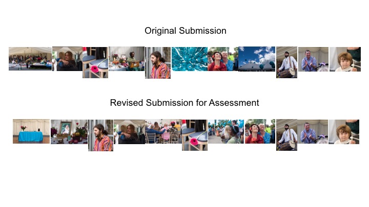
This submission consists of eleven A4 prints.

The filmstrips below are intended to help the Assessor to see what changes have been made to the original set of images in response to feedback from my tutor (see previous post).  A larger version of this is also included on the Assessment Google Drive here.

IandP_Assignment 3 Filmstrip

This Assignment has been particularly insightful to understand the impact that individual images, and their position within a set, can have on an overall work.  Having decided on the final selection and order using draft 5×4 prints, the final submission was then printed on A4 paper.